Week of Weak Images | Day 1

This week I've decided to share a week of weaker images and give a little self-critique in hopes that sharing the images I'm not thrilled with in my own creation bank will help encourage you with yours.
This first one was day 3 of my current project, a month of images.
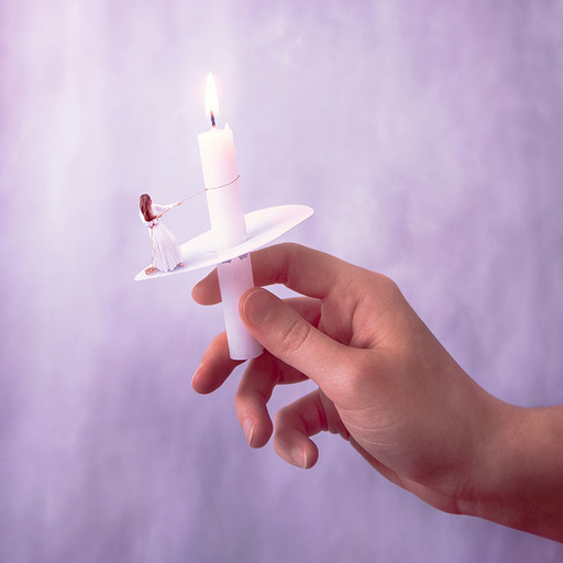
The idea behind this was that the girl is climbing toward the light. She's scaling with a rope toward the candlestick, grounded and supported by the light even though she hasn't reached it yet.
Instead, I feel it comes off as trying to pull the candle down. A futile attempt, and a halfhearted one at that.
The coloring is interesting, but not sure that it works for this image, and it certainly doesn't help with the concept except for adding a dreamlike atmosphere. The color could have been okay for a different concept, but for this one it would have worked better with a darker background to accentuate the contrast of light and dark.
I do like the larger hand position and maybe this edit could work if there was a different pose. If I were to try this again, I think dangling off the edge would be more effective, or at the very least changing the pose so it looks more realistic for climbing or maybe slipping off the edge of the wax guard.
Or maybe the pose should be something different entirely. Perhaps with the girl sitting next to the candlestick, or leaning with her back against it, or even clinging to it with her arms... And I suppose I could have done that with the rope too and had it tied around her waist and the candle.
To me this image left the concept falling flat, and not communicating anything clearly. It could be fixed and adjusted by different color toning and different subject interaction.
Maybe I'll try a related concept in the future.
Do you look back and critique your own work? Do you ever remake old images that seem to fall flat?