Week of Weak Images | Day 5

Day 5 of weak image week.
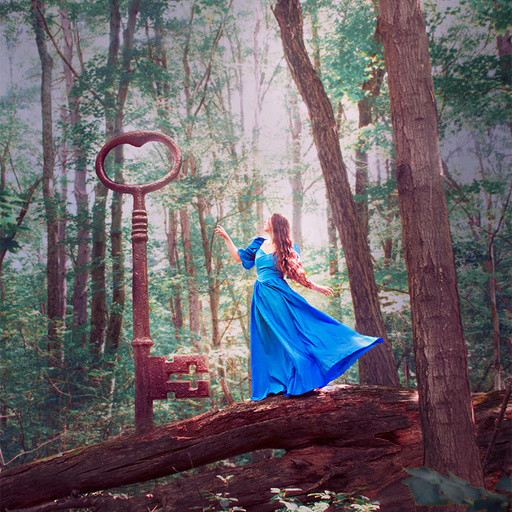
This was taken on my birthday last year. I went out into the woods alone with a dress and some props, and decided to just play around and see what I got. Moments like that are some of my favorites. Those moments make me feel alive like nothing else.
So creating this was more about the experience than the final product.
The key was my grandmother's. She always had hanging on her wall until she gave it to me a few years ago.
Originally I was going to have a door emerging from the log, but I liked the idea of the key growing from the fallen tree.
My focus was a bit off in this. Instead of setting it ahead of time I used a remote on autofocus, which sometimes doesn't get it quite right, so I had to sharpen in Photoshop, which I don't like to do. (I think this is the only image I've actually done that for.)
The colors feel unnatural to me, but not in a good way. They feel a bit unbalanced, and there's too much green. I hate green. It makes me think of death, so I try not to use it.
There's also too much red in the midtones and shadows. And the light in general is too harsh for my liking. I prefer to use diffused light.
It also feels a bit busy and I'm unsure where to look. Having a more faded background, and probably darkening it up a bit would also help.
The concept isn't clear or very strong, but with some more thought it could be refined.
Overall, I had fun making it, and that was what I was after. Is it really failure if you have fun through the process?
Do you have any colors that you specifically don't like? Any you try not to use in your creations?